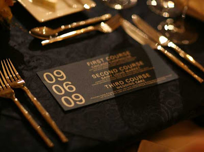
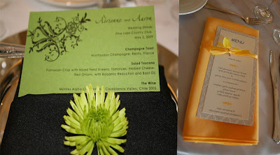
Enter the wedding menu card! (Cue music. Or the sound of chewing. Don't eat the menu card, please; it's not edible.)


The menu card can be a fun way to spice up the table decor, and since our linens are pretty bland and the task looked pretty easy, I went ahead and threw some of these together. Here's how!
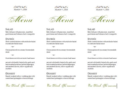
Step 1: Open a Word document. Set the page up with a landscape orientation and 1/2" margins all the way around.
Step 2: Set up three columns with a 1" gap between them (each column will be 2.67").
Step 3: Type away!
I steered slightly away from the fonts I used in my invitation suite: I kept the Palatino Linotype block font, but instead of Shelley Allegro/Sheer Elegance I switched to Porcelain (a fussier font, I think, but more visually interesting). Since I was using Mr. Spaniel's photo printer instead of my usual laser (which has a nasty habit of bending my card stock into curls, as I discovered while printing our thank you cards), I decided to also play with a little bit of color. A very little bit of color:

I first saw "Eat. Drink. Be married." in Mrs. Peep Toe's recaps and thought it was pretty cute... now I get to use it!
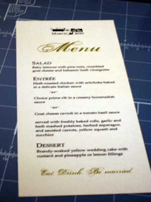
Step 4: Print on card stock. I used ivory colored card stock from Staples, and the shade of green came out absolutely perfectly on it... it matches the ribbon I'm using for our programs! (What programs, you ask? Patience, grasshoppers.)
Step 5: Cut your card stock into thirds. This can be tricky if uniformity is important to you, but I just pulled out a ruler and marked off three and (a little tiny bit past) 10/16" and cut. My rotary trimmer is my lifesaver.
Step 6: Fin! There is no step 6! Unless folding them into napkins is your step 6.

Speaking of which, that's what we'll be doing with these: setting one inside of the napkin at each place setting. And I am very, very happy that someone else will be doing that job. :)
Did you find yourself adding DIY projects to your list in the last few months leading up to the wedding?
Those look great! We were going to do the same thing but decided not to to save some money. I think we're going to frame one menu at and put it at a table where the guest book will be instead. I love palatino linotype myself!
ReplyDeleteThose turned out very nicely! I am leaning toward maybe doing a stand-up menu at each table. 400+ menus = too many trees to kill for the wedding. We'll see how it goes. Thanks for the simple tutorial!
ReplyDelete